SMO ETF Full Report Tue 2026-01-20 (Phase -1, Bearish Early)
This report provides one objective top-down market -> sector -> stock perspective to facilitate long capital allocation to strengthening areas and short capital allocation to weakening areas.
The conviction here is that most influence on any individual stock price comes first from market forces then sector forces. As it would be foolish to expect strong surfing performance in terrible weather and ocean conditions, so would it be difficult to pick one stock to perform well when the market and sector tides are weakening. Some can do it. I cannot. So was borne this method to objectively discern market and sector strength/weakness before focusing on individual stock strength/weakness.
There is no guarantee of trend continuations. This goes both ways. All one can do is discern, for their purpose and using their chosen methodology, which direction the market and/or sector and/or stock is going, then allocate available capital accordingly.
Market Summary
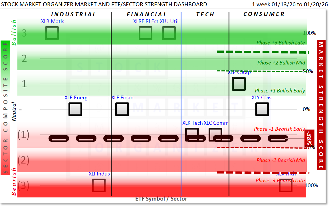
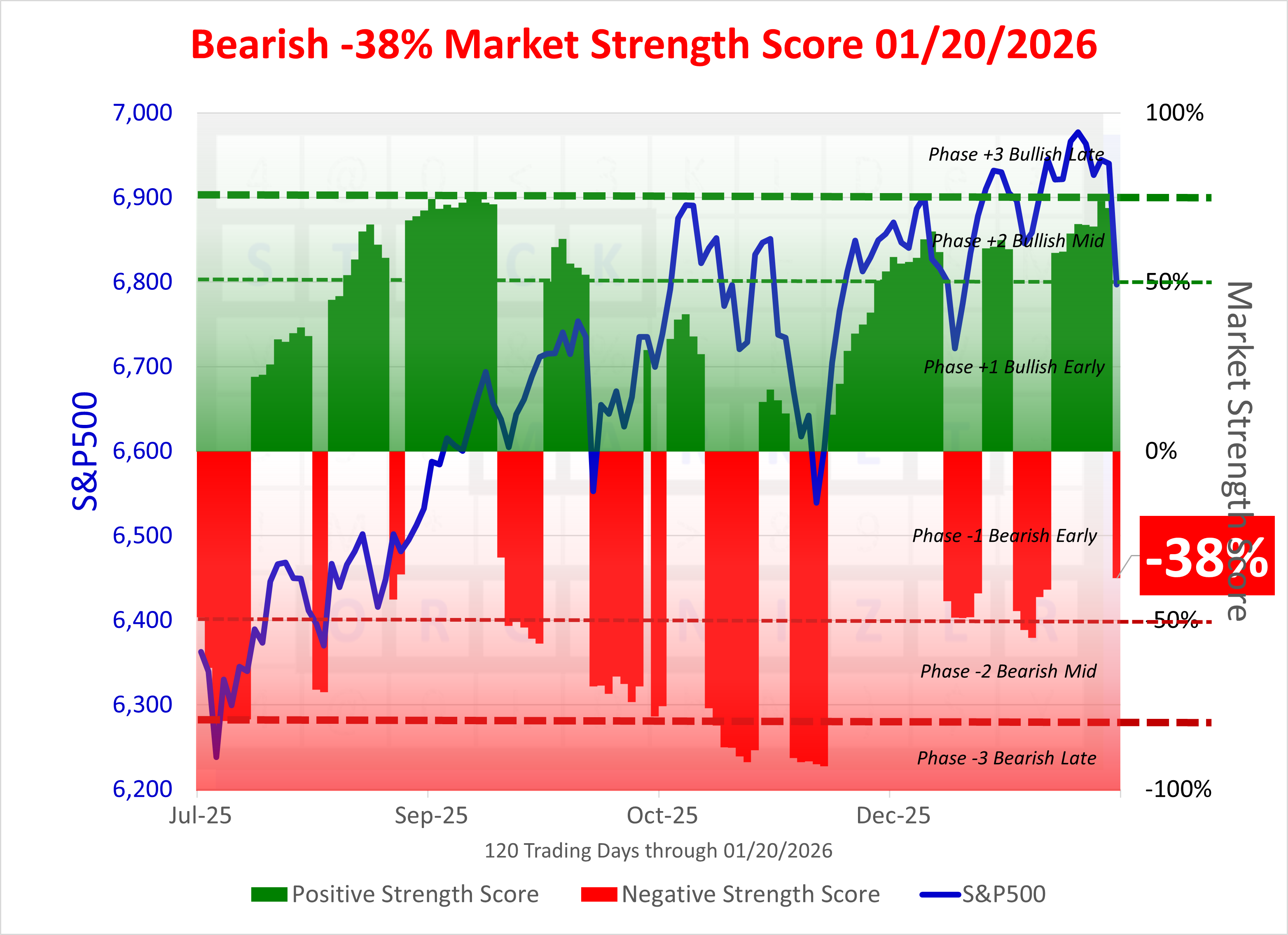
The Market 6-Phase Gauge + the Market Strength Score = unique current market environment depiction and insights.
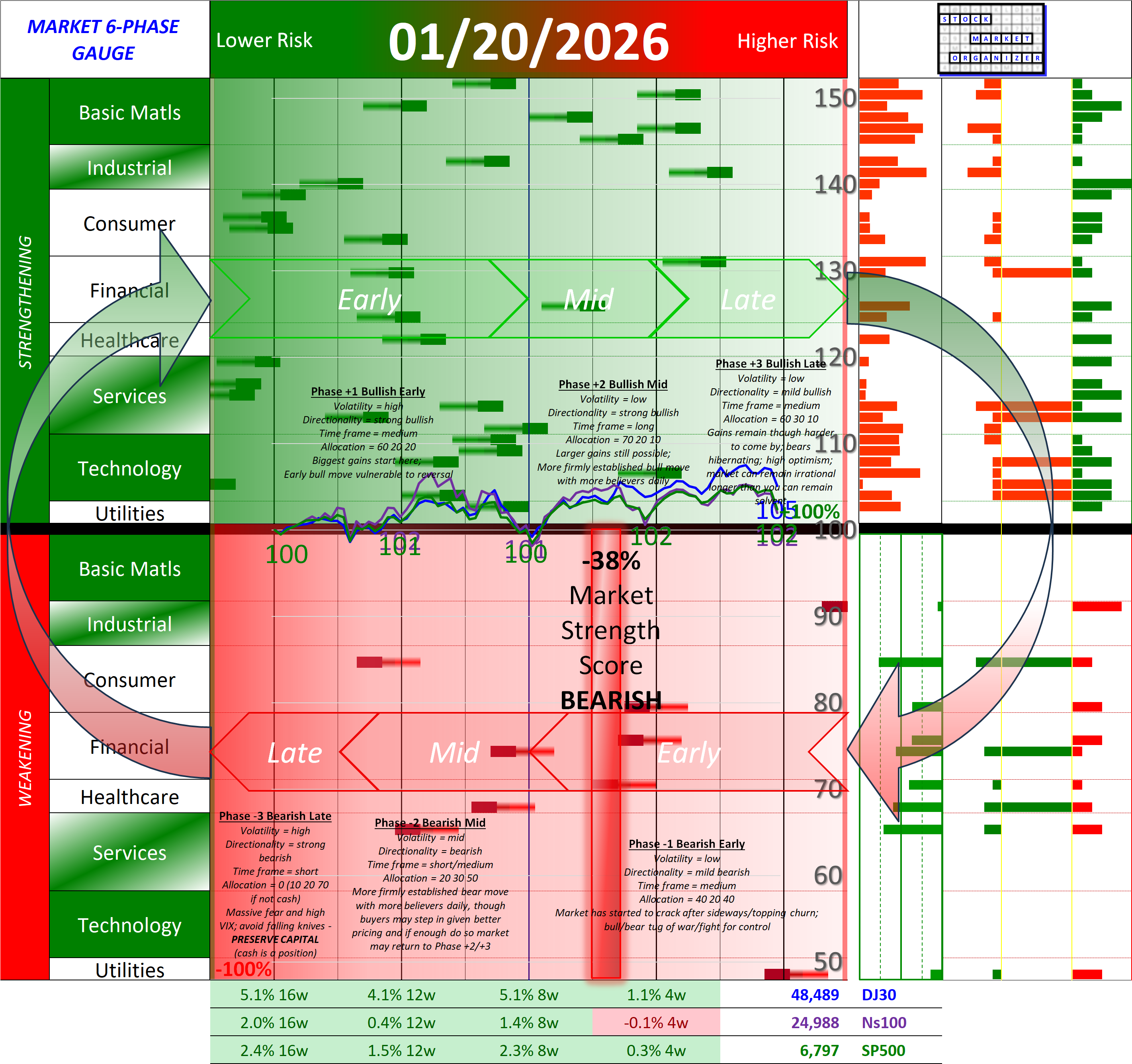
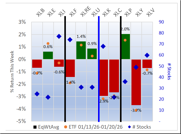
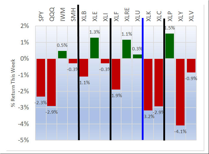
Weekly returns re-cap - the first chart below shows the equal weight returns for the 11 ETFs and the second shows the returns for four indexes and the 11 ETFs.
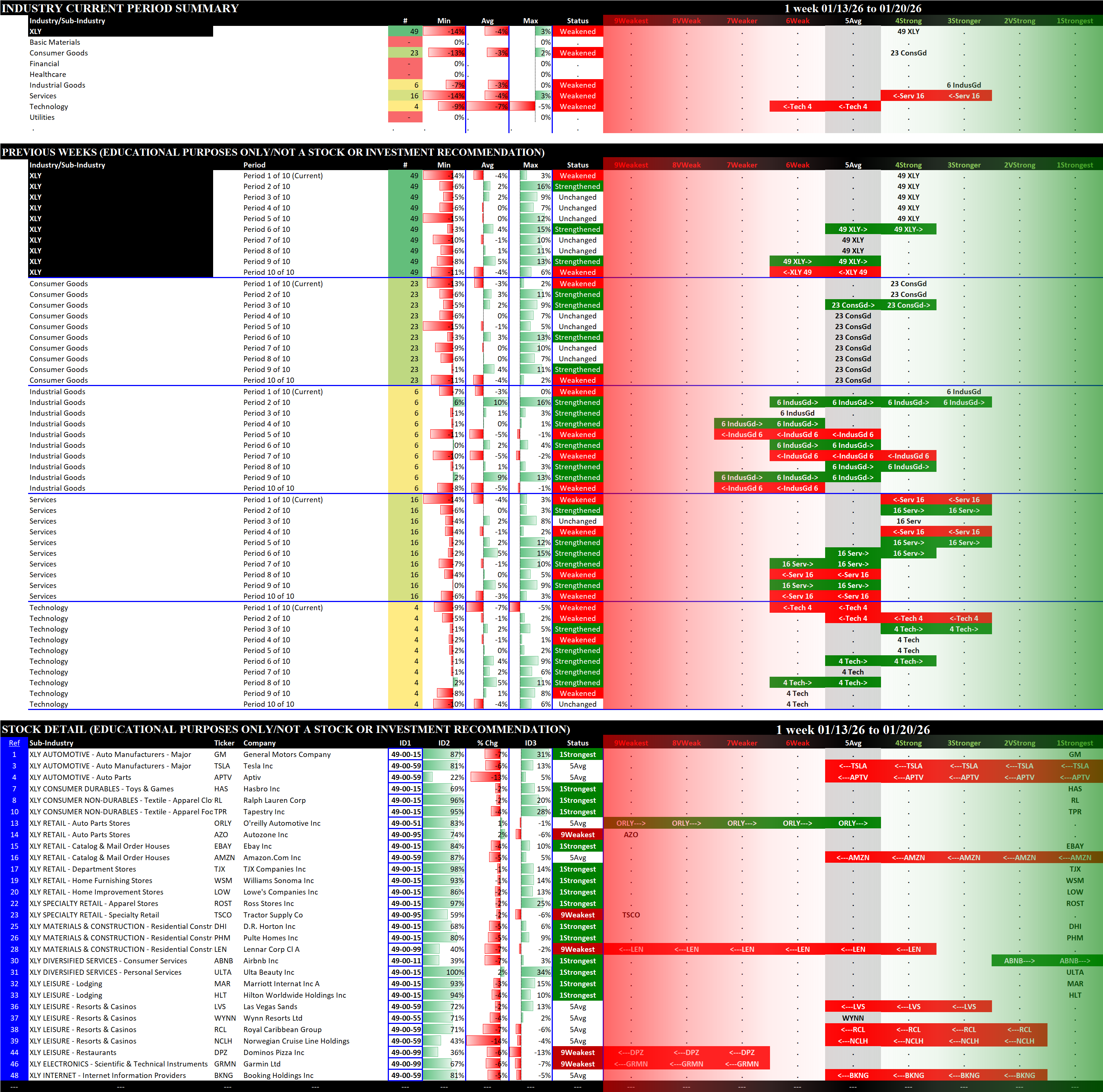
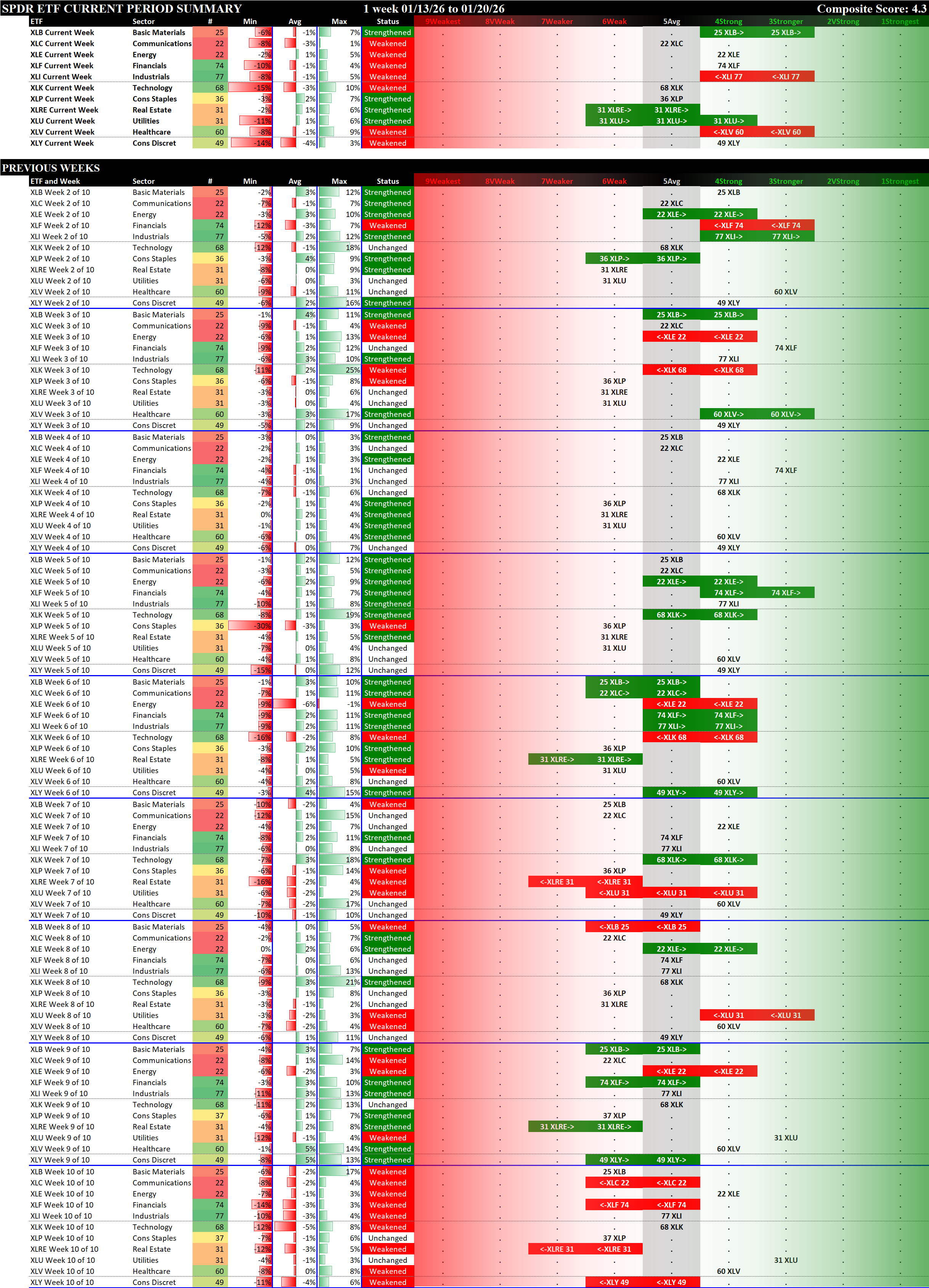
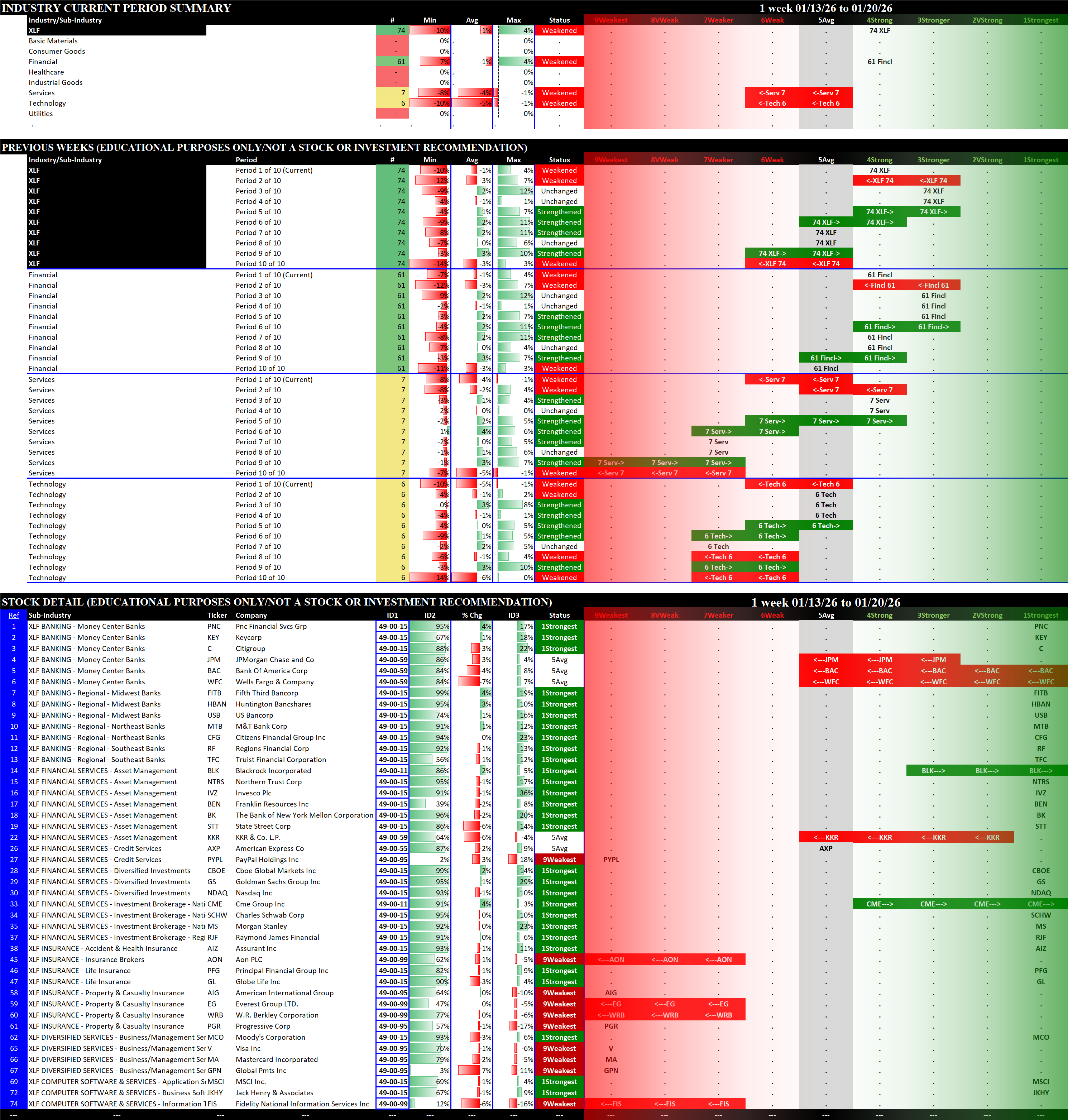
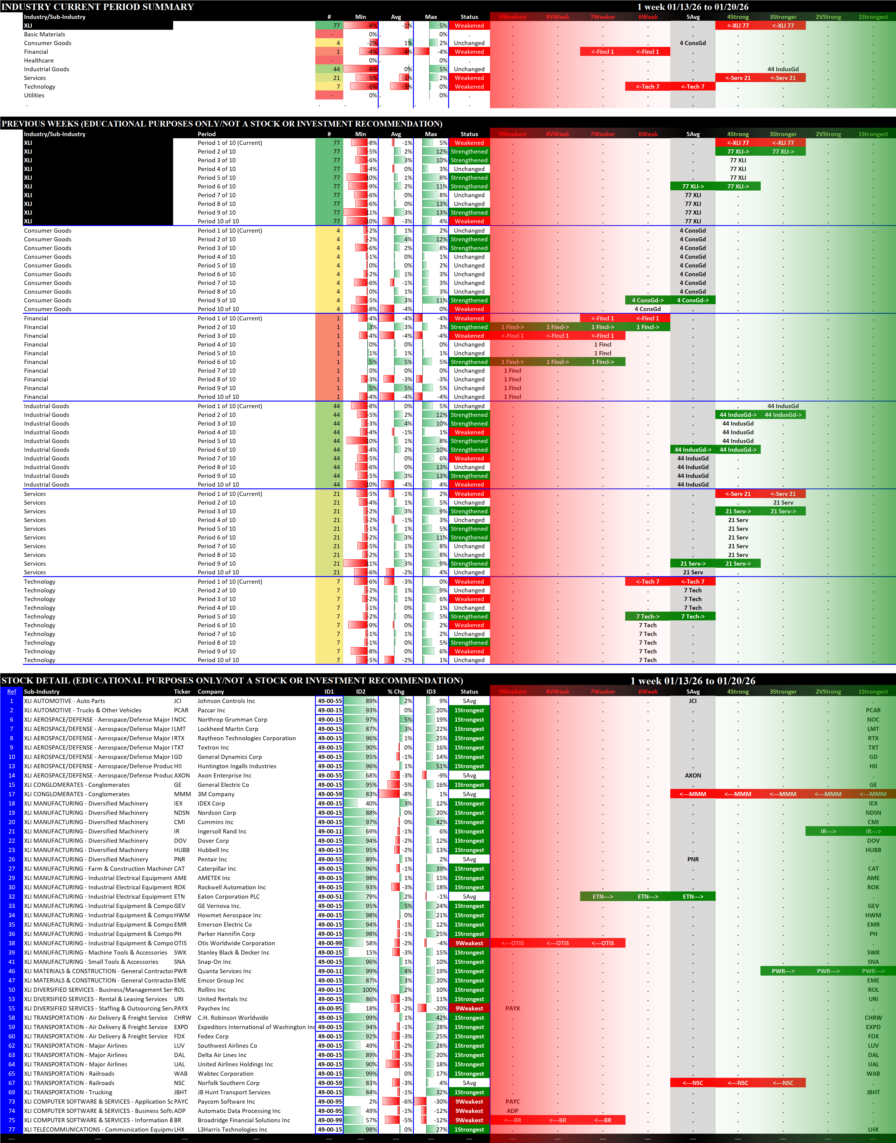
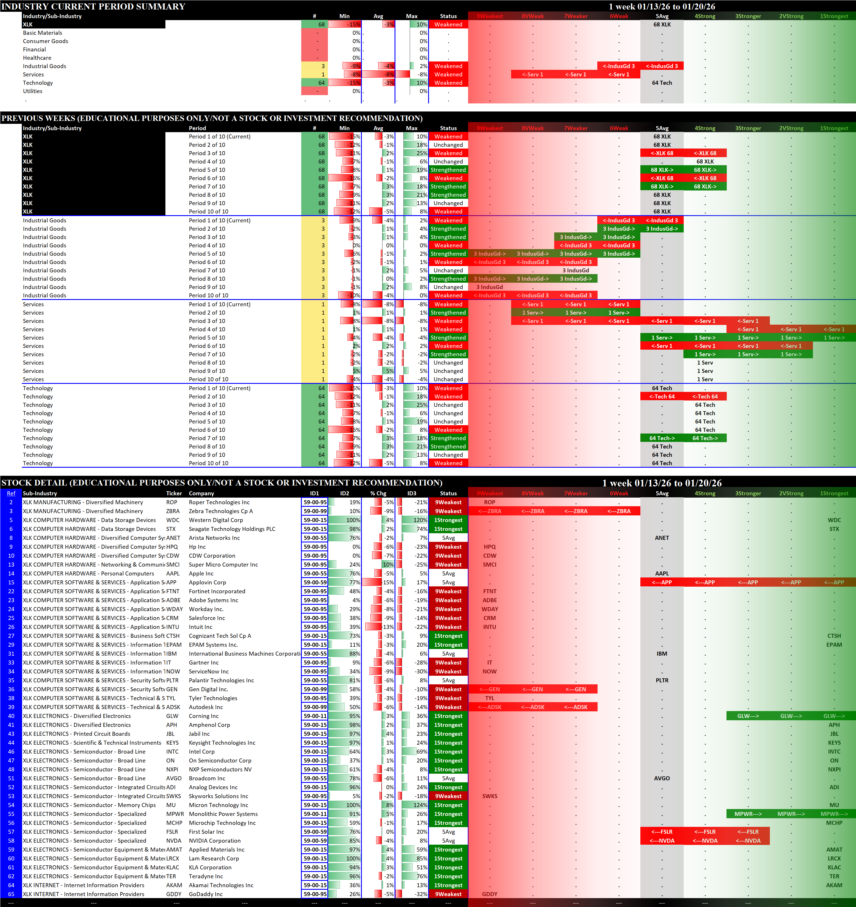
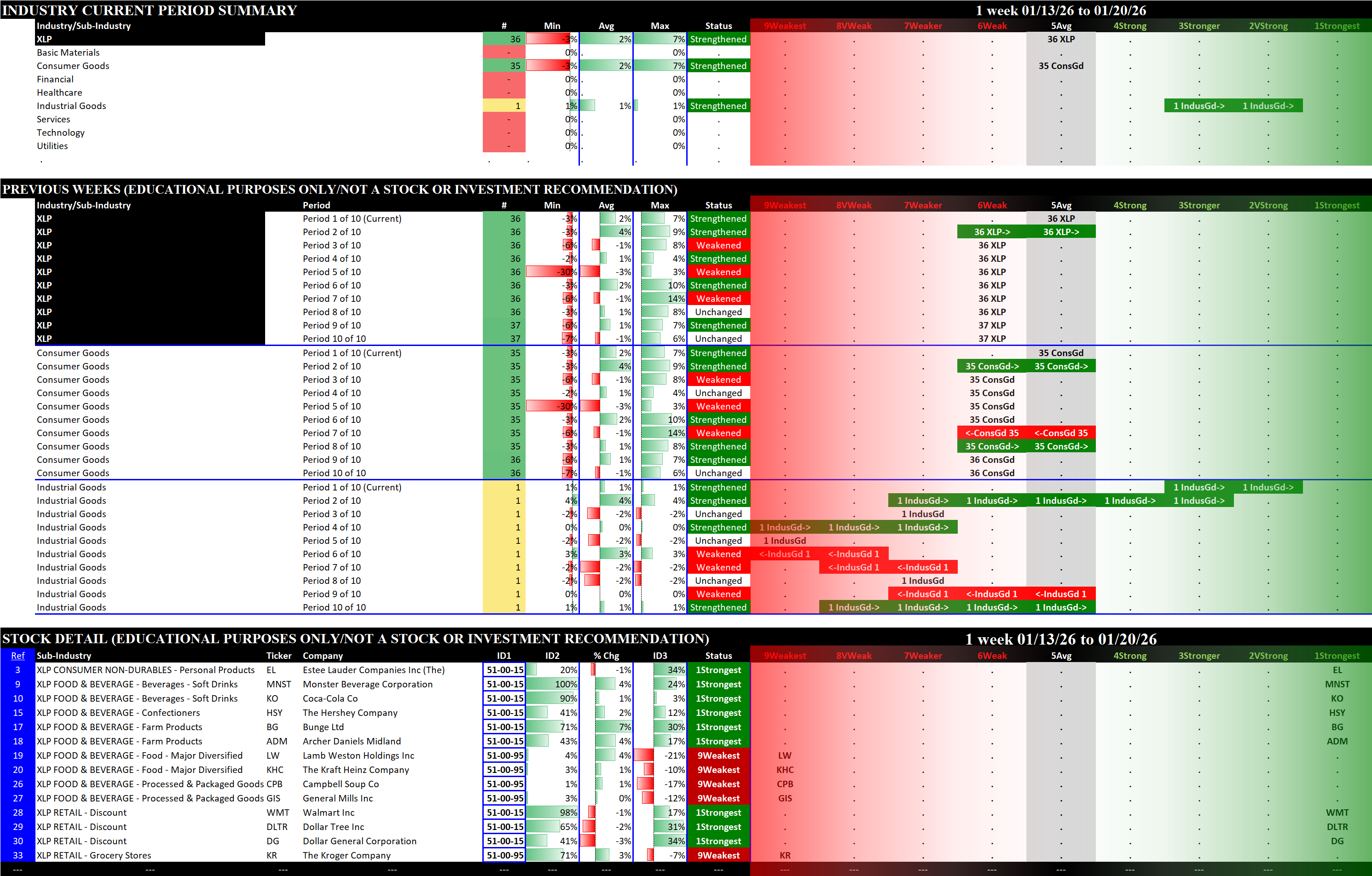
Sectors Summary
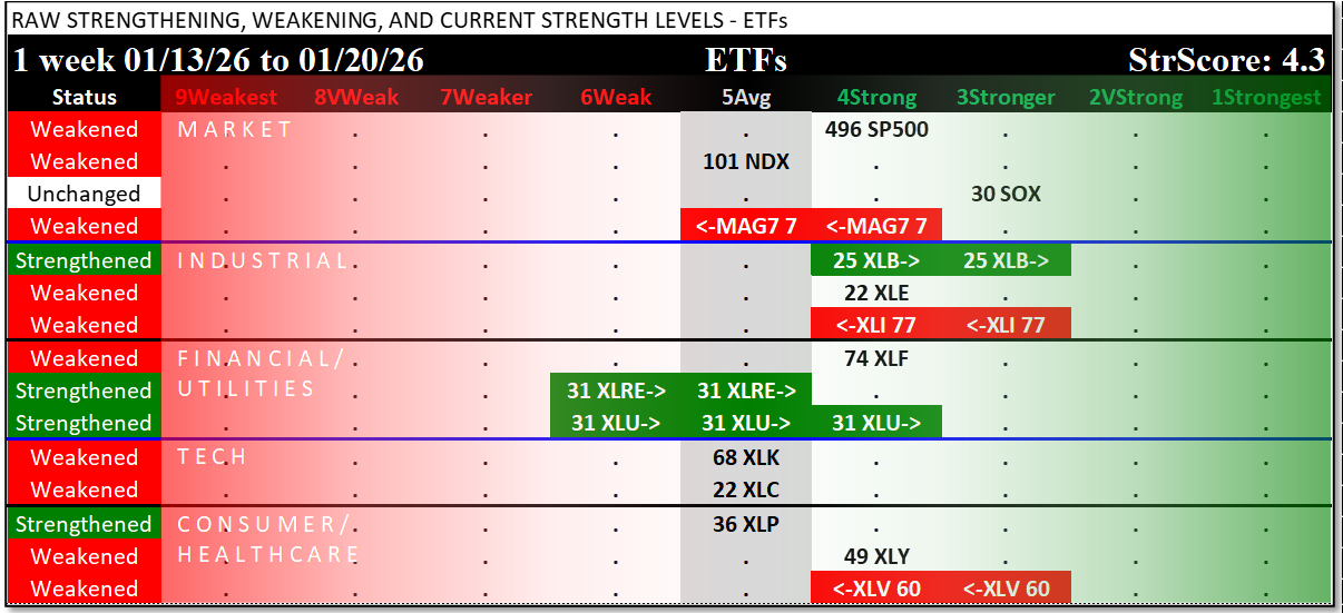
The introductory Market and Sector Strength Dashboard converts to actionable information the raw strengthening, weakening, and current strength levels shown in this spectrum graph. So-named because it shows the spectrum of possibilities from 9Weakest to 1Strongest, this graphic shows the raw strength readings and just-completed week changes for each sector (with market readings for comparison):
10-Week Summary
The following two graphics show recent history for context. These are presented in spectrum format to illustrate if and when strengthening or weakening is extended.
By ETF
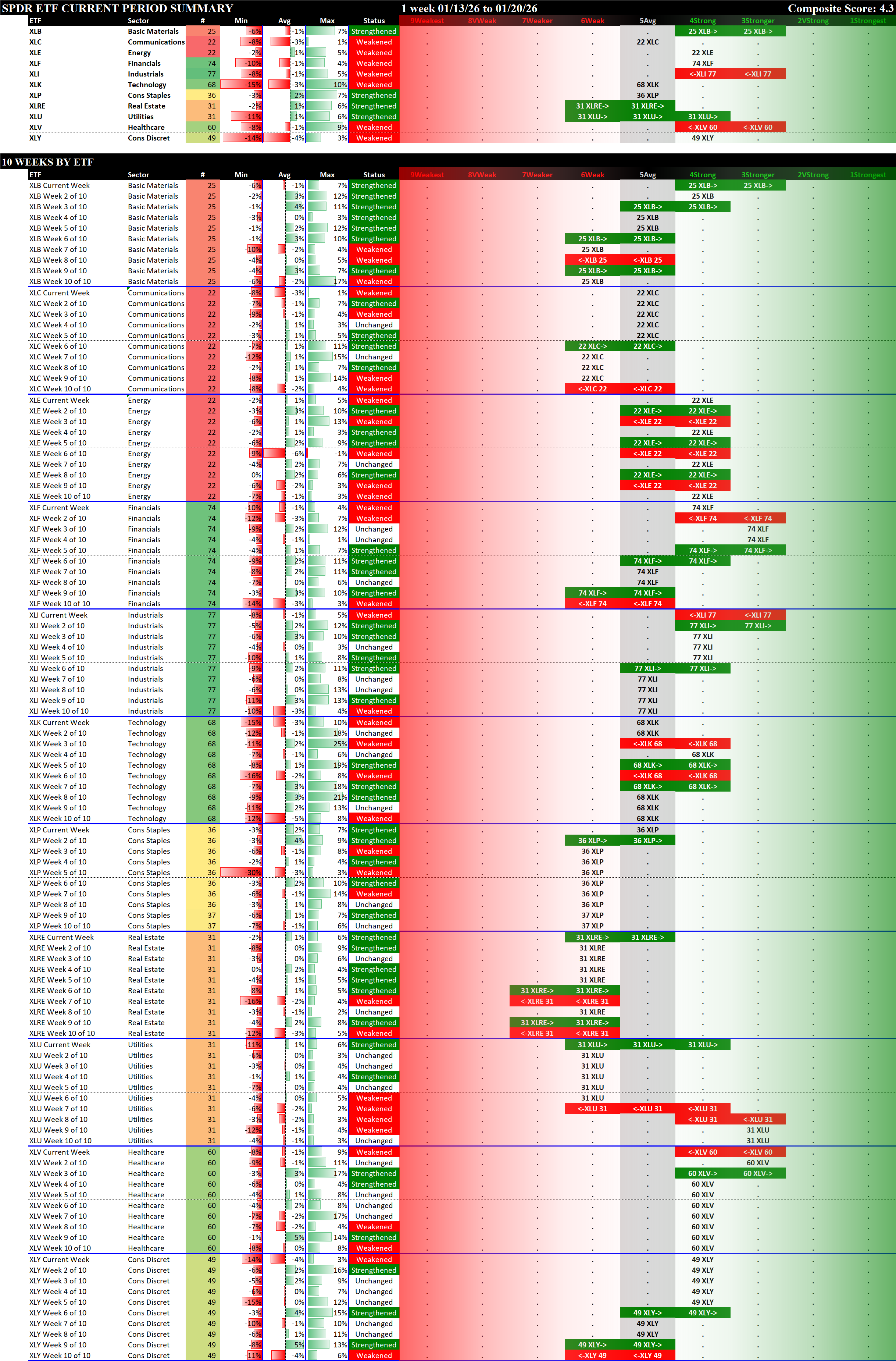
By Week
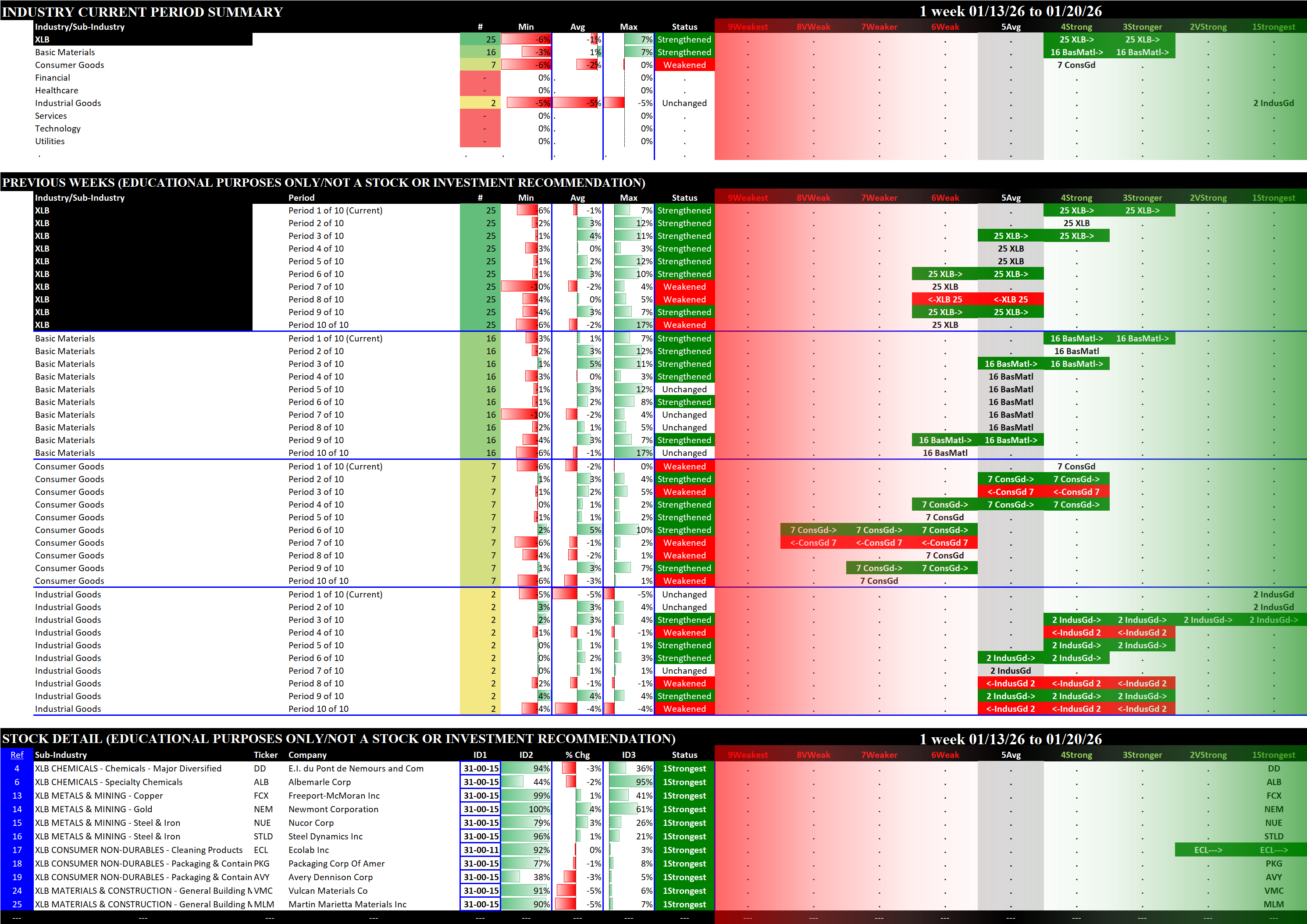
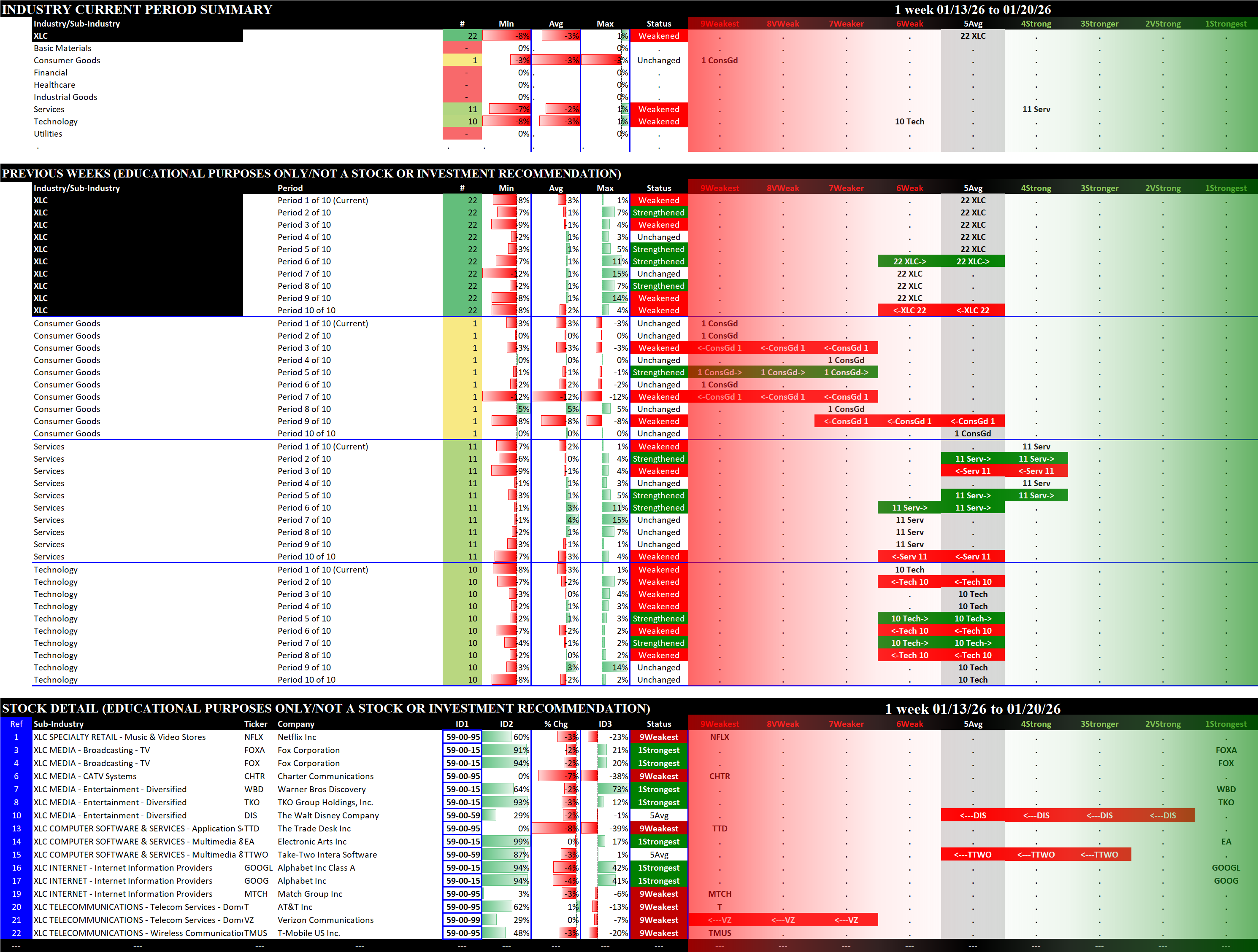
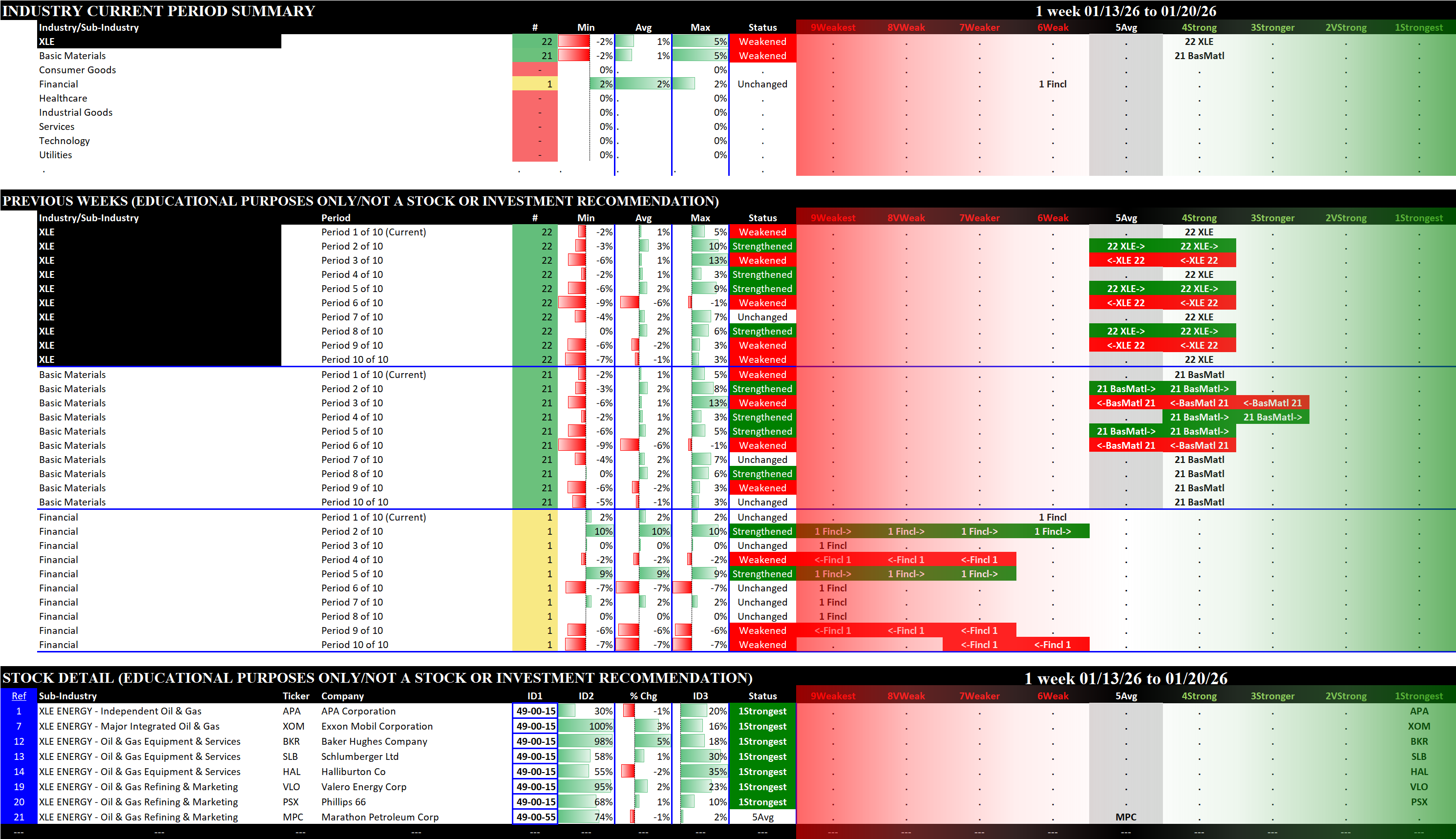
By-Sectors Summary
XLB
XLC
XLE
XLF
XLI
XLK
XLP
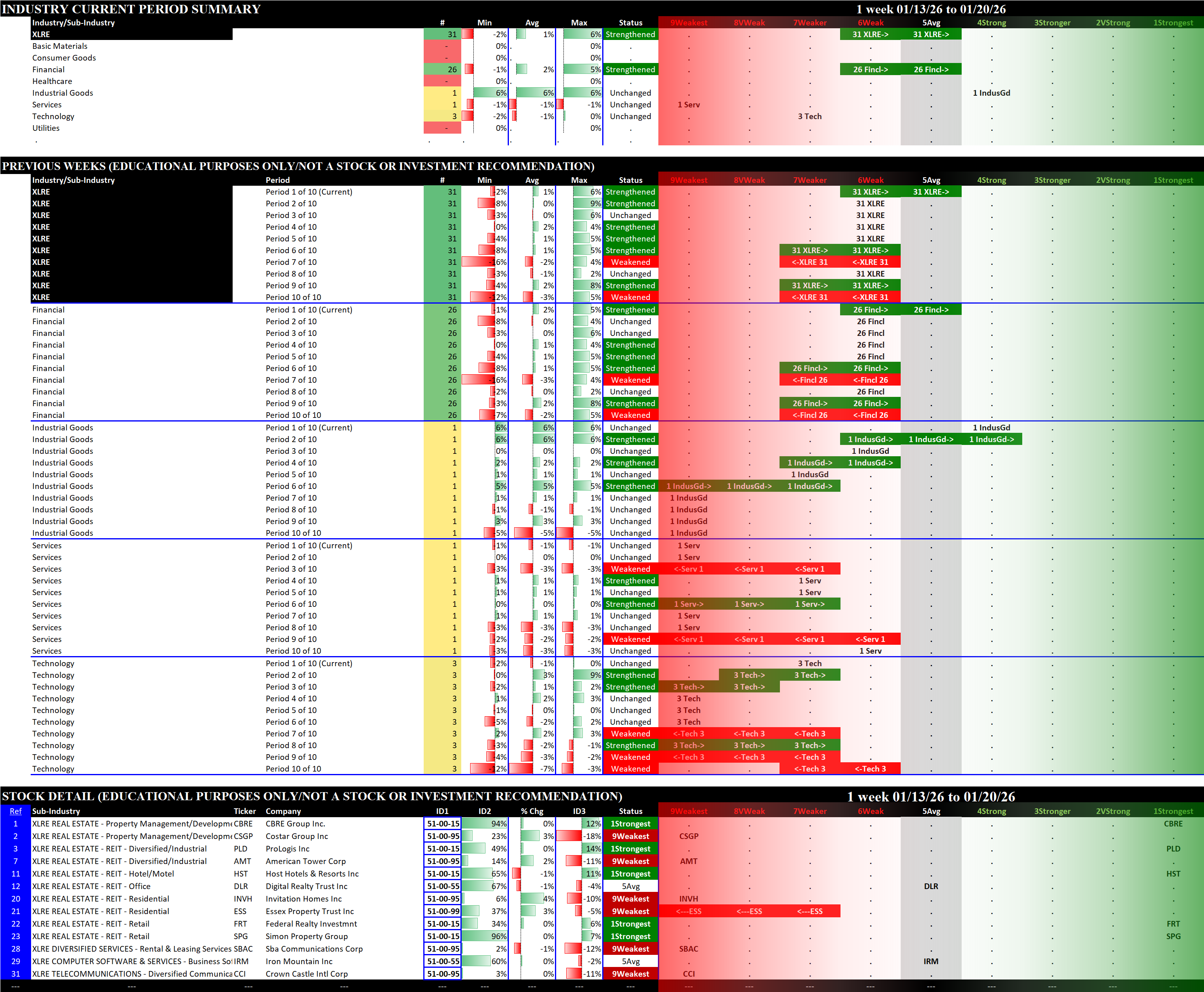
XLRE
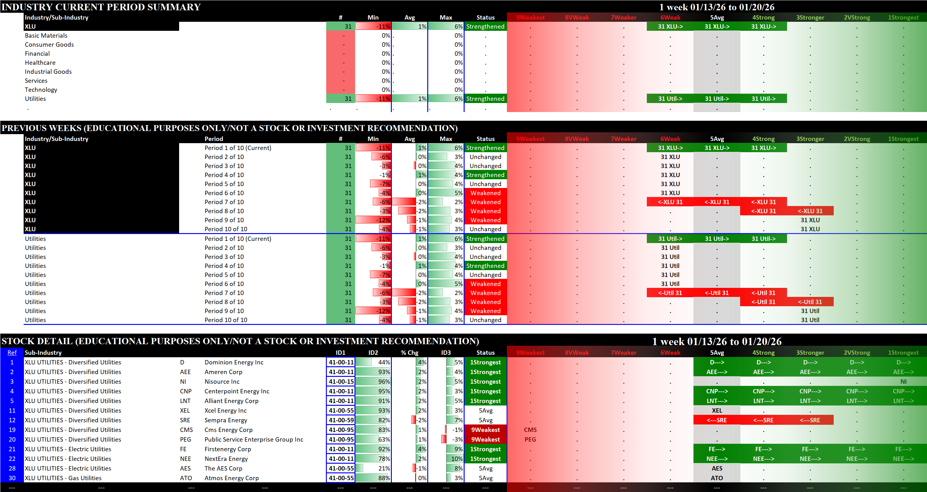
XLU
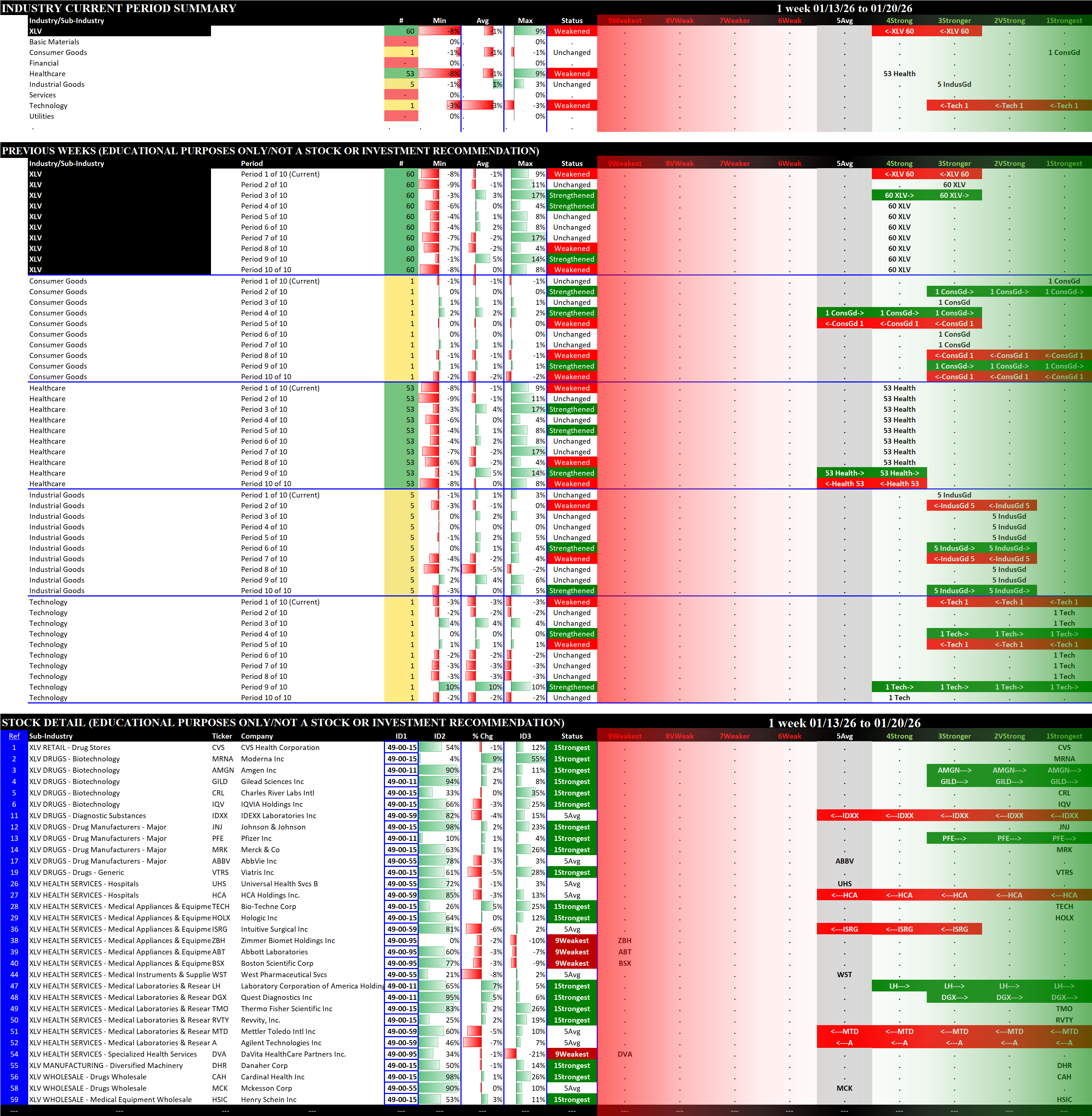
XLV
XLY